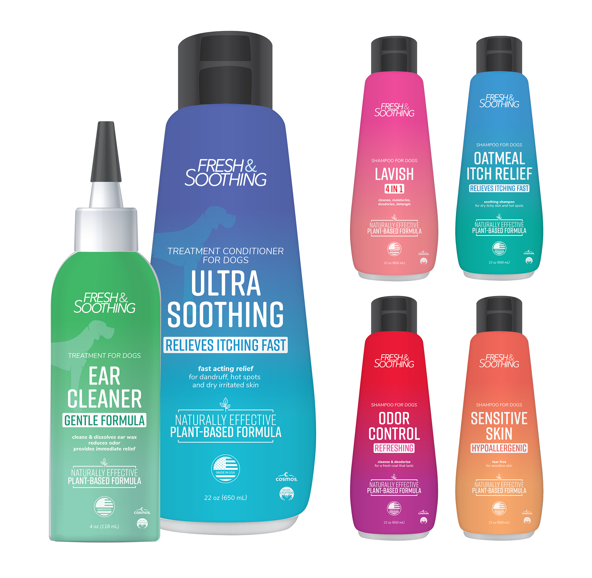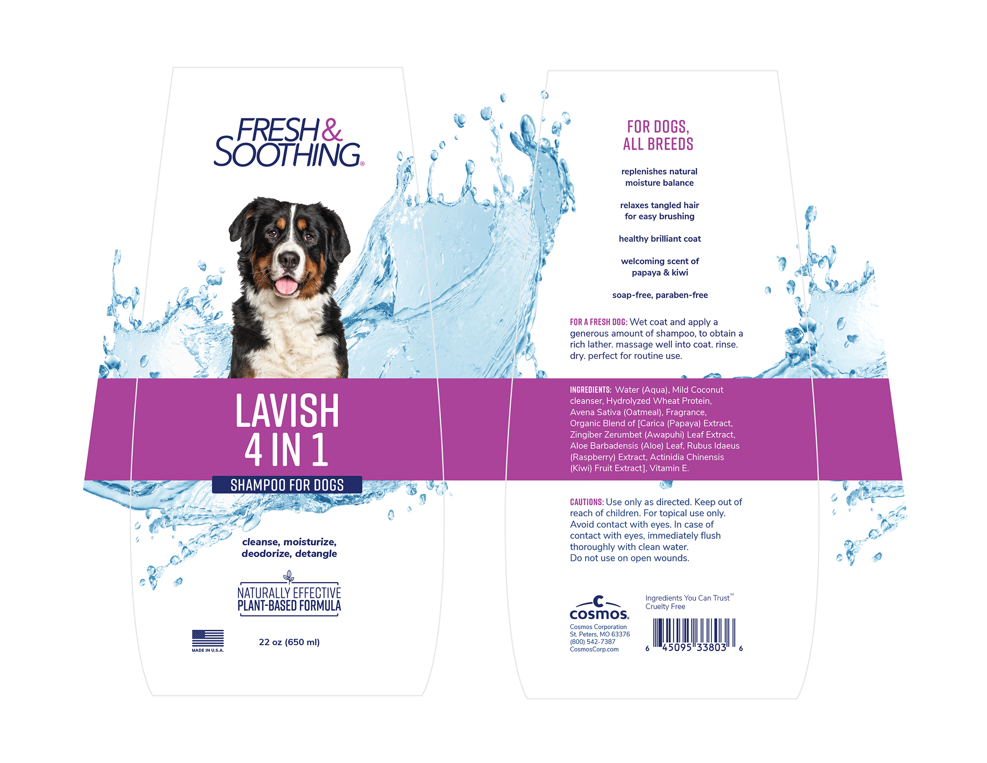


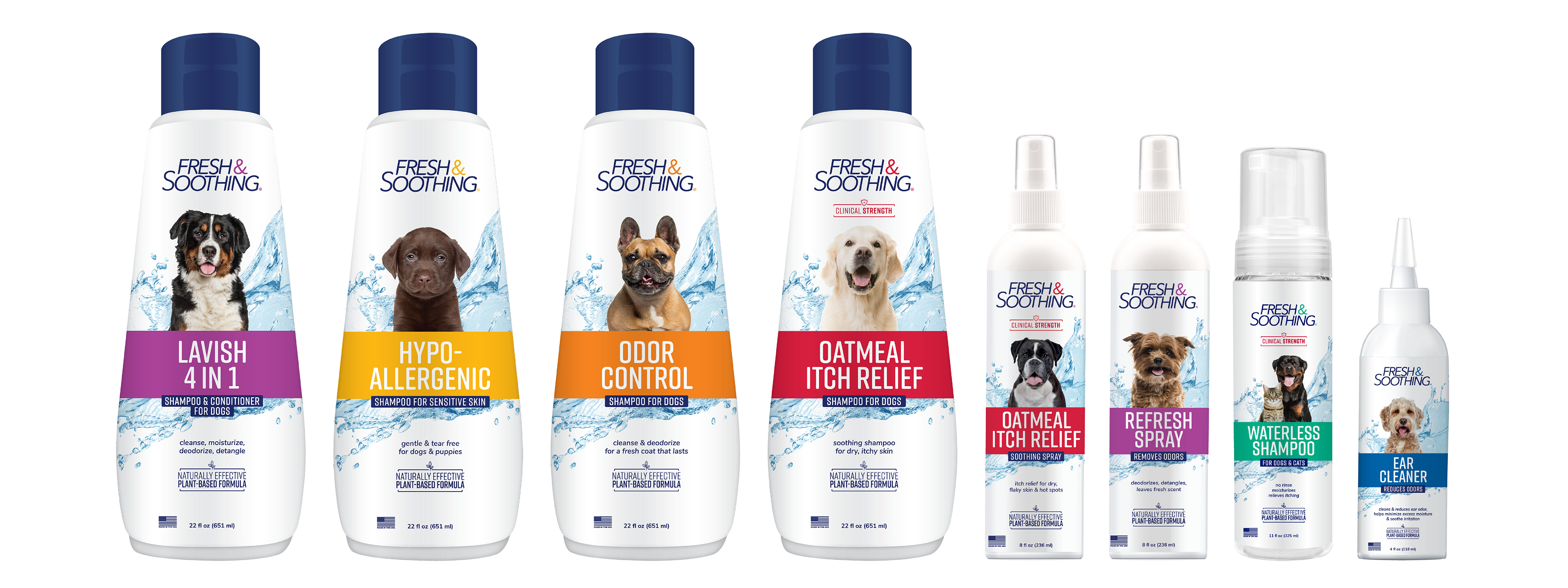
Fresh & Soothing provides gentle, effective bathtime and between-bath options for pets. The brand has existed for years and when it came time for a redesign, I was given the opportunity to play a major role in redesigning the product packaging. I worked with various company teams and key players in the project going through many rounds of revisions. The resulting redesign was pitched exclusively to Walmart, was received incredibly well, and now specific Fresh & Soothing products can be found in Walmart stores across the nation.

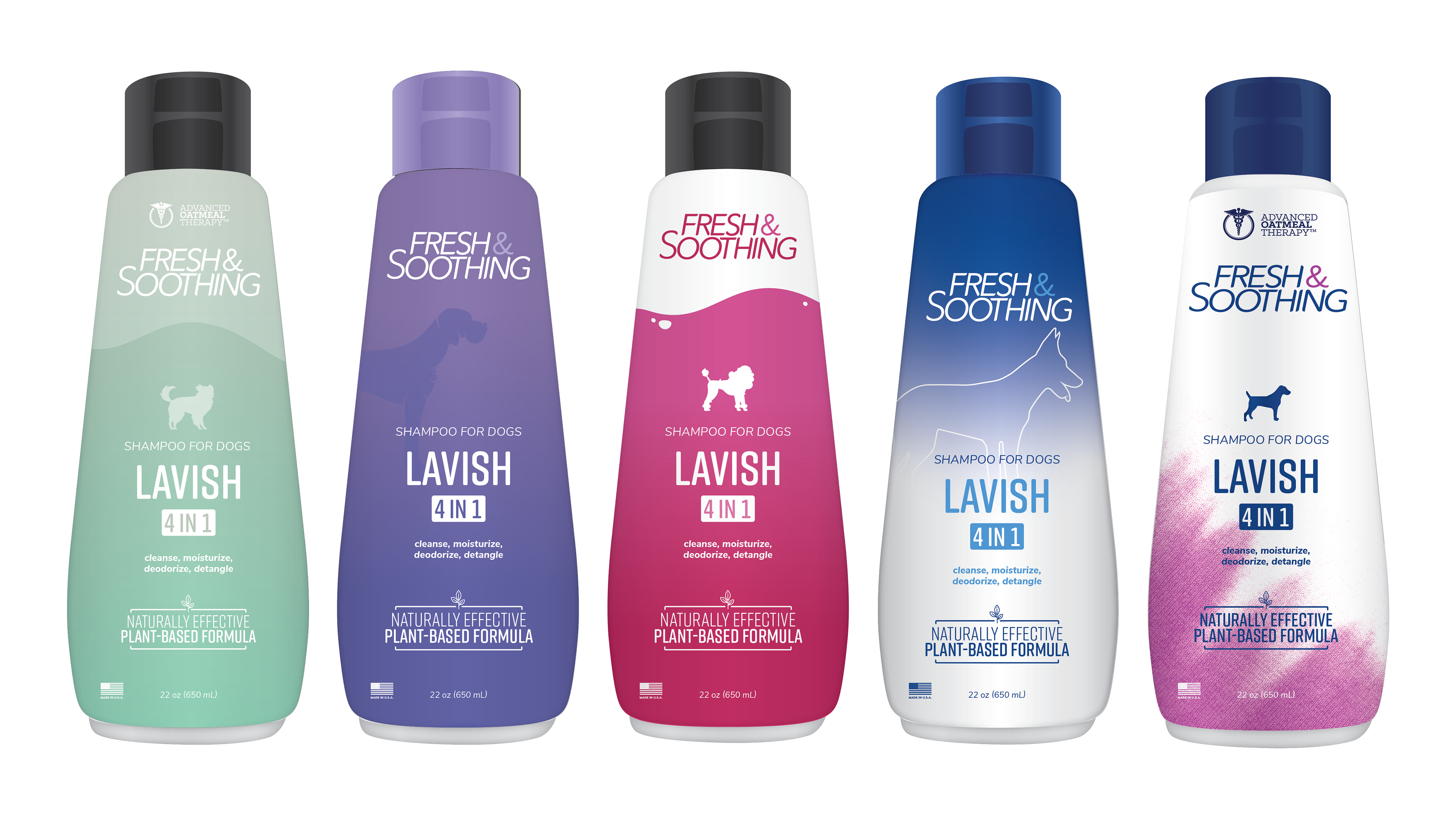
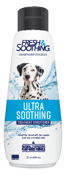
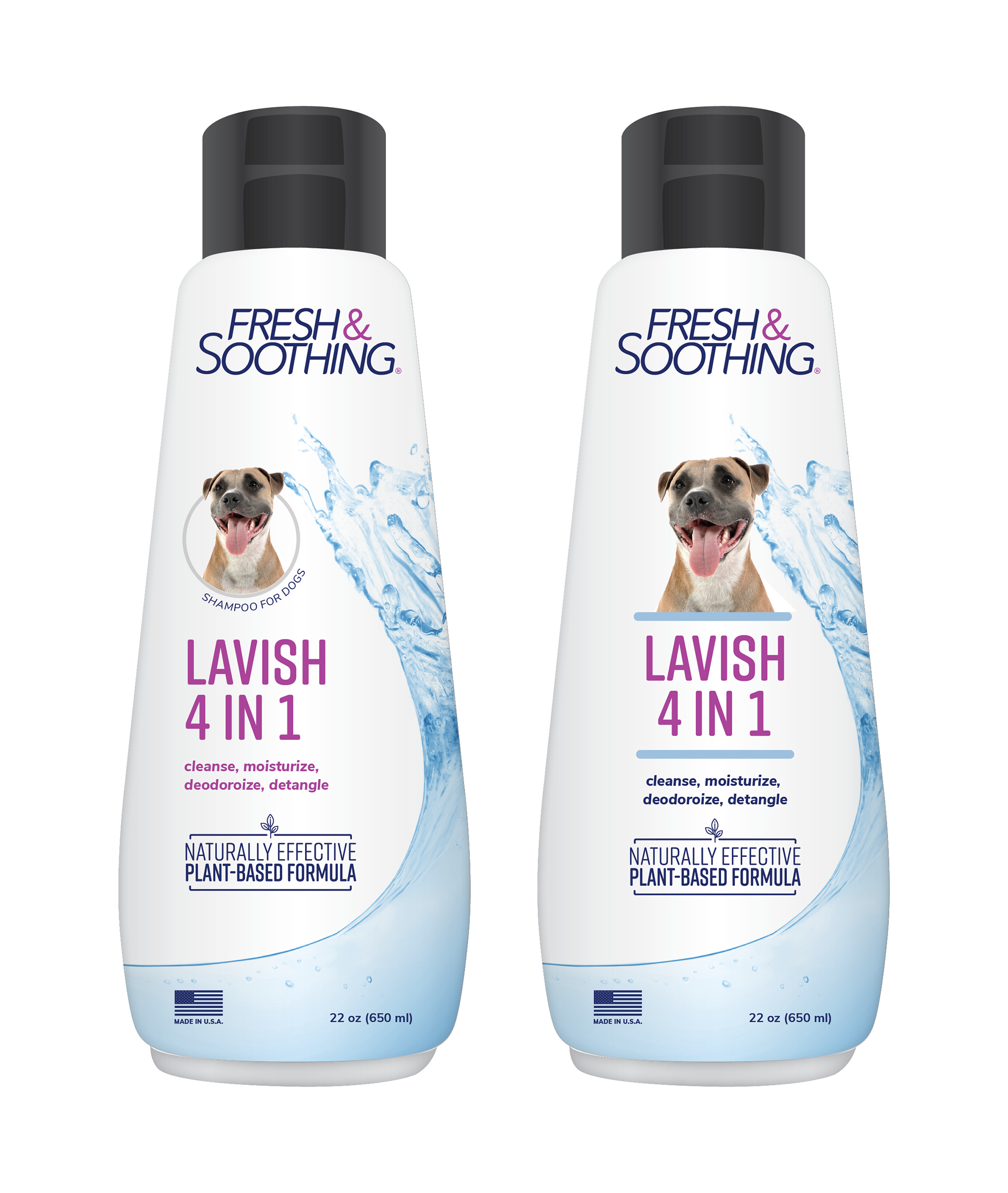
This project was intended to be a refresh, so we kept the logo, the general colors, and the general background idea of a water splash. Everything else was redesigned. The water splash was updated for a more modern look. The dog portraits were refreshed and brought in closer for better focus. I designed the band for hierarchy for the product name as well as to highlight the plant-based formula on the back. I matched the "&" and the registered mark on the logo as well as highlighted words on the back with the product band color for interest. Typography was simplified for readability.

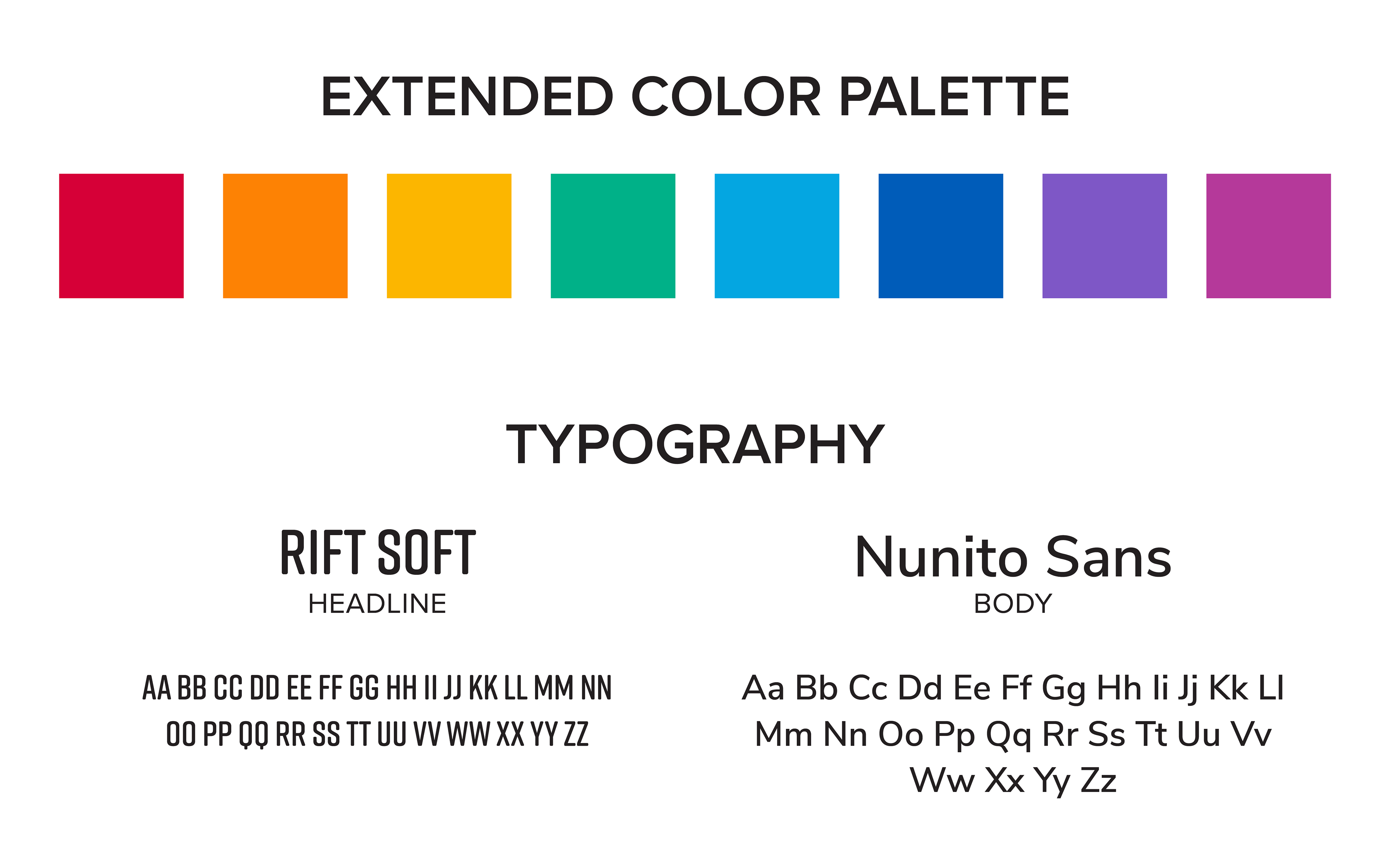
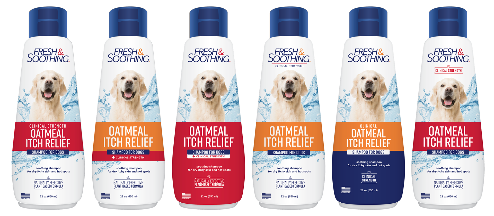
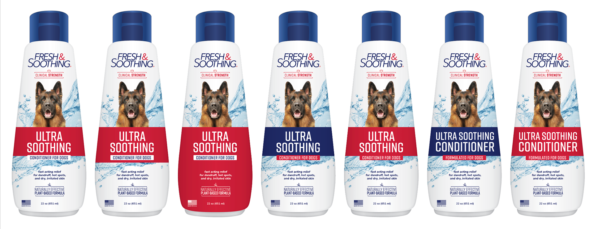
I went through an incredible amount of colors and fonts before I settled on these. Ultimately, the color palette was chosen because it was bright and stood out on the shelf. As you'll see below in my process, I did play with having these bright colors in the background, and while those options were liked by reviewers, they were ruled too high end looking for the intended buyer. The old slab serif fonts were not working well with the design, so I chose all new fonts that were more readable and modern, and connected better with the rest of the design. I loved Rift Soft because it flowed well and was a great headline font for the product name and other call-outs.

These icons were designed to better call out the information we wanted to convey the best to the buyer. I used Rift Soft for a composed design. In the future, as the line is potentially expanded, the icon design allows for more icons to be added for a unified look.
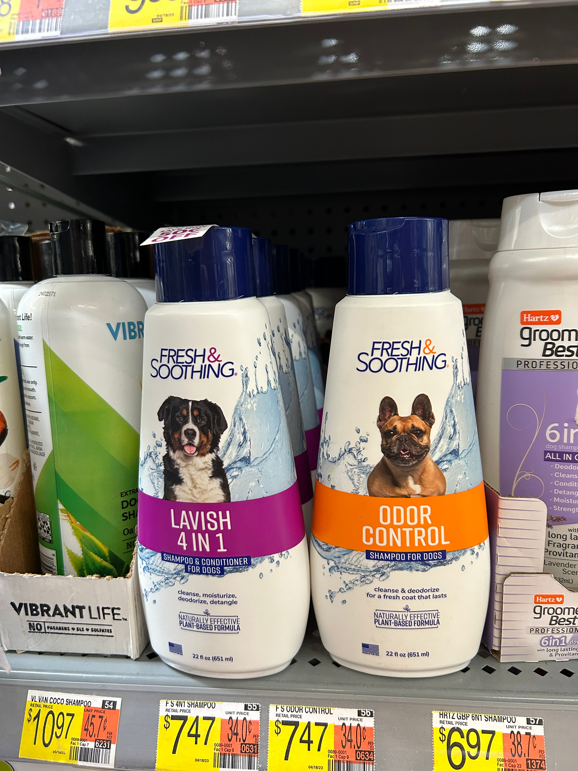
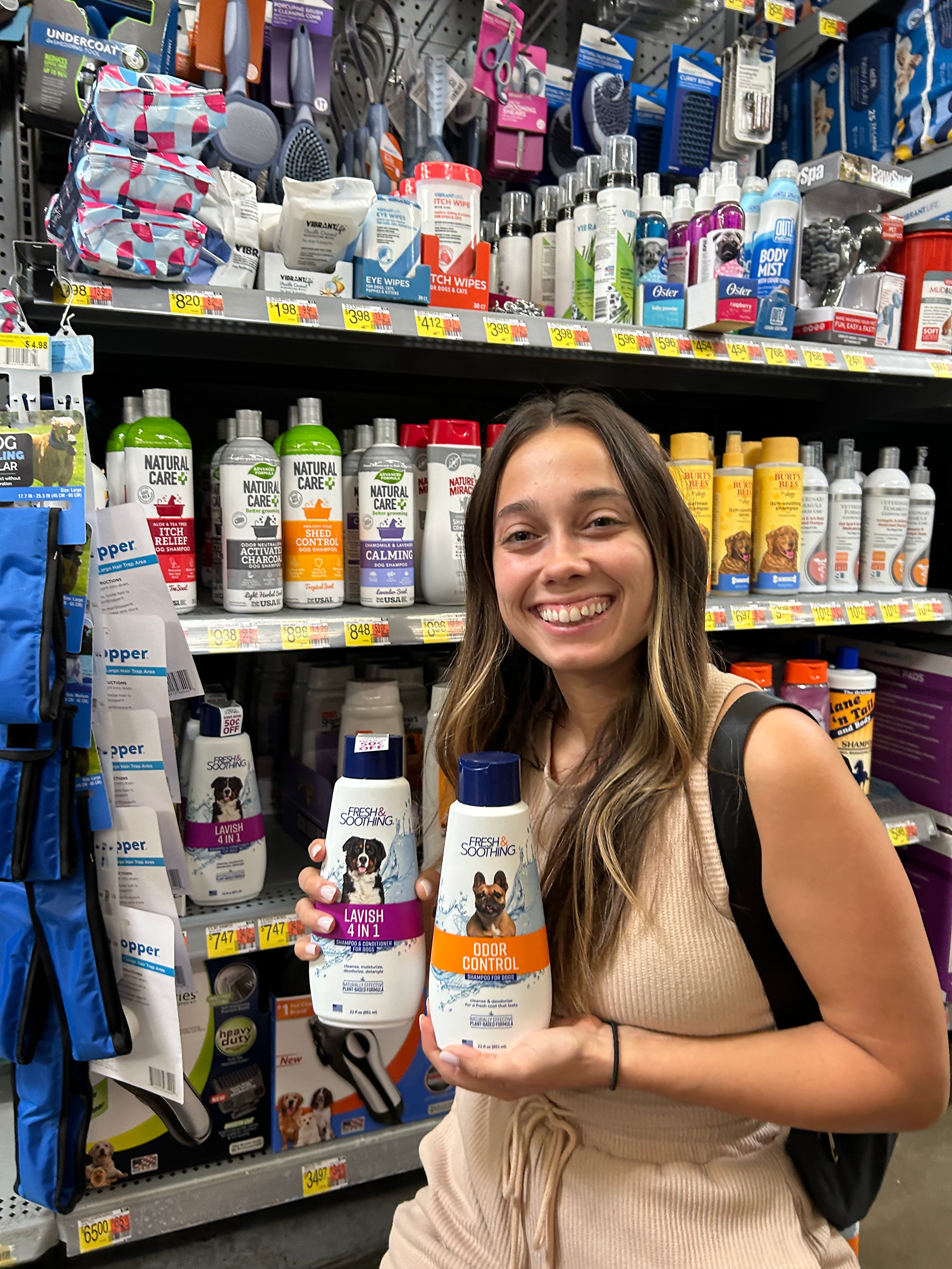
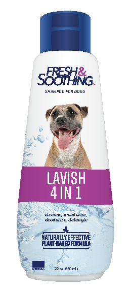
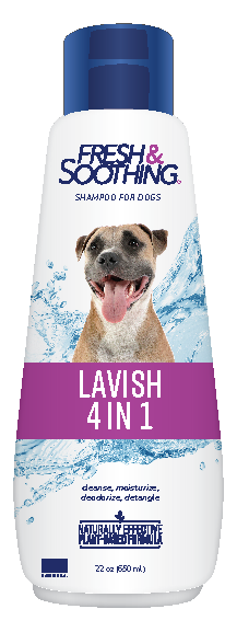
The images above show two of the Fresh & Soothing Shampoo products in my local Walmart. I am honored to have had the opportunity to fully redesign a product that was loved by Walmart and ended up on their shelves.
I want to credit my team members, Resa, Lacie, and Abby for their help, feedback, and support they gave me to make this project so successful.
I want to credit my team members, Resa, Lacie, and Abby for their help, feedback, and support they gave me to make this project so successful.
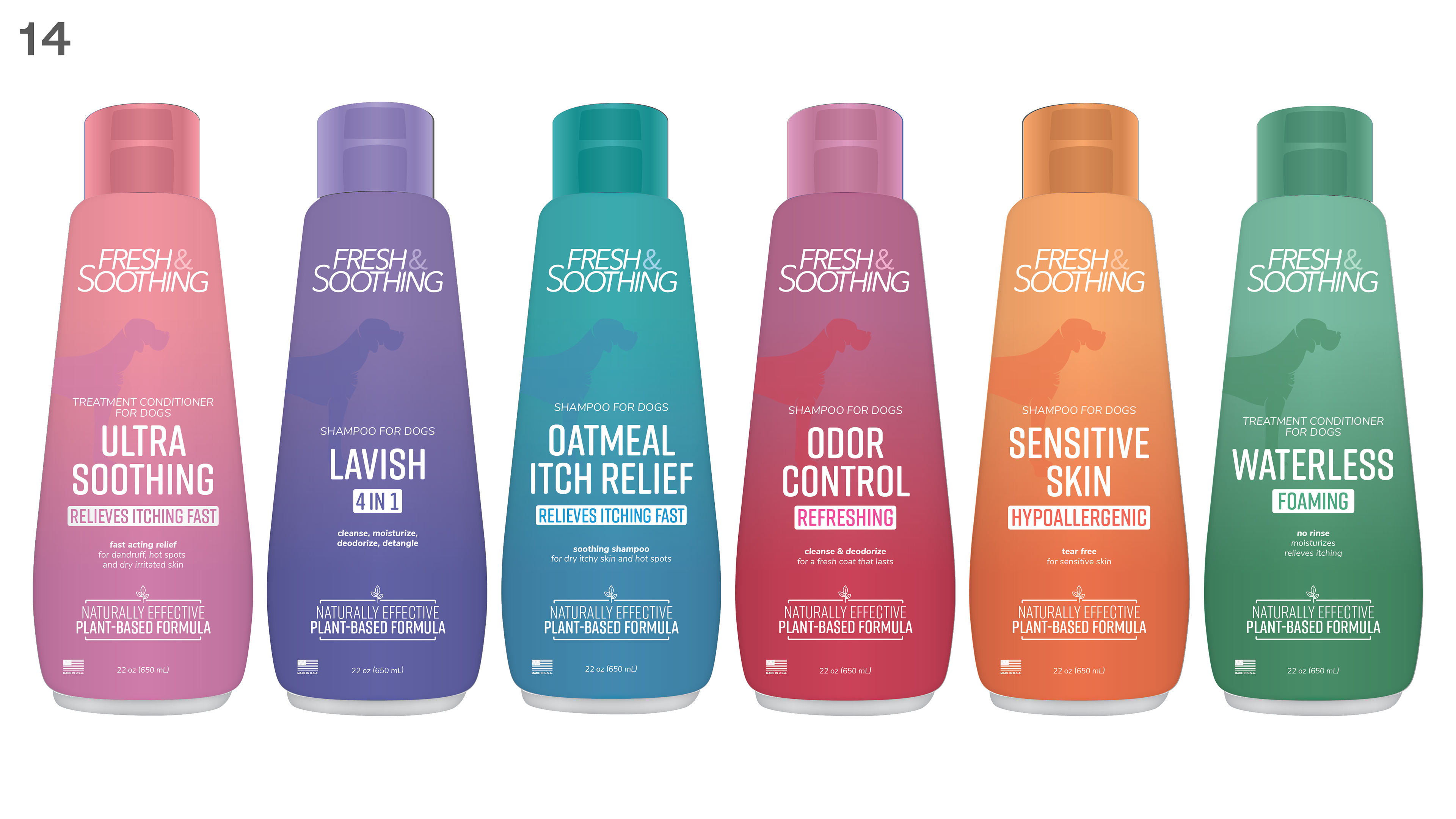
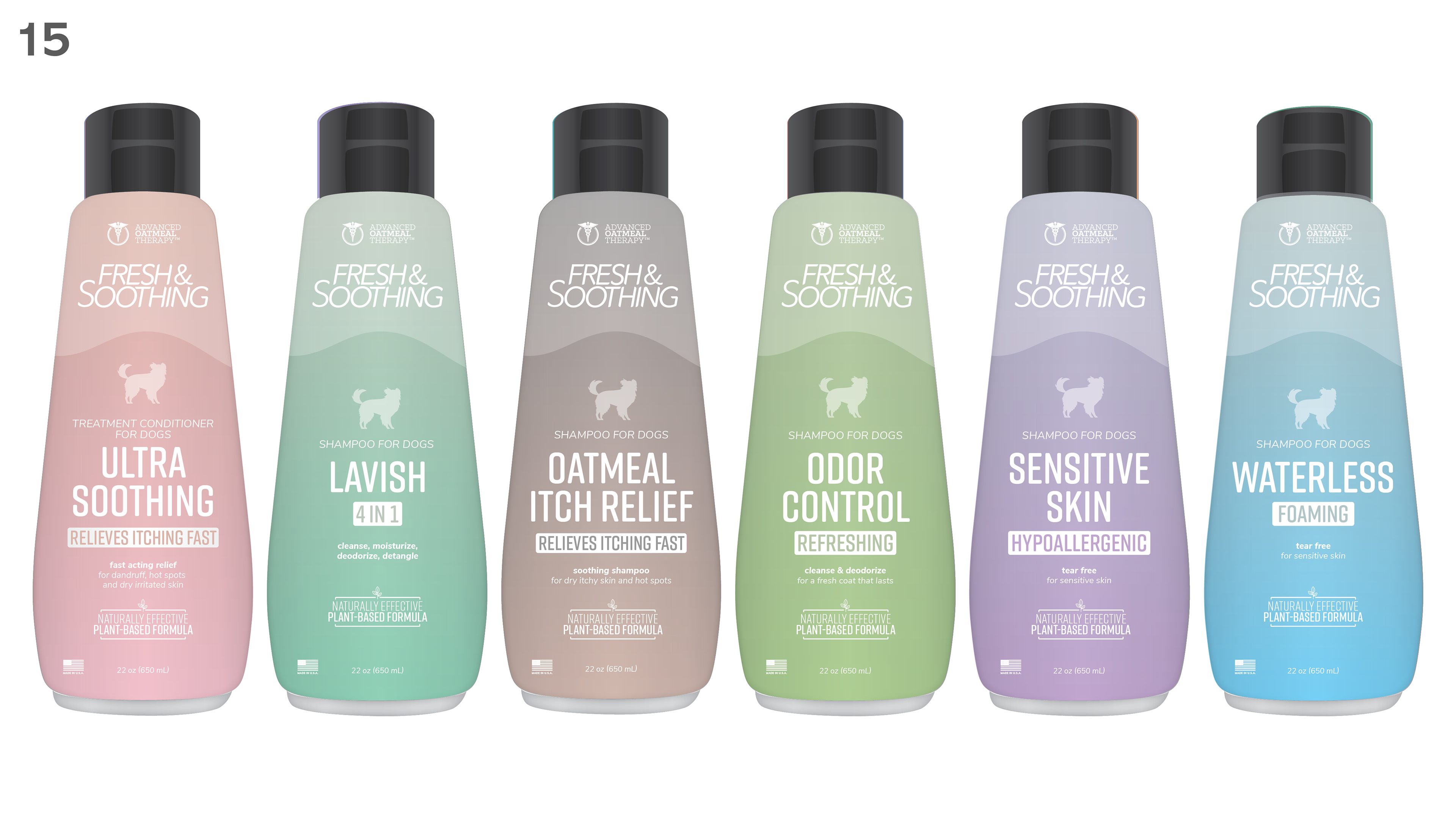
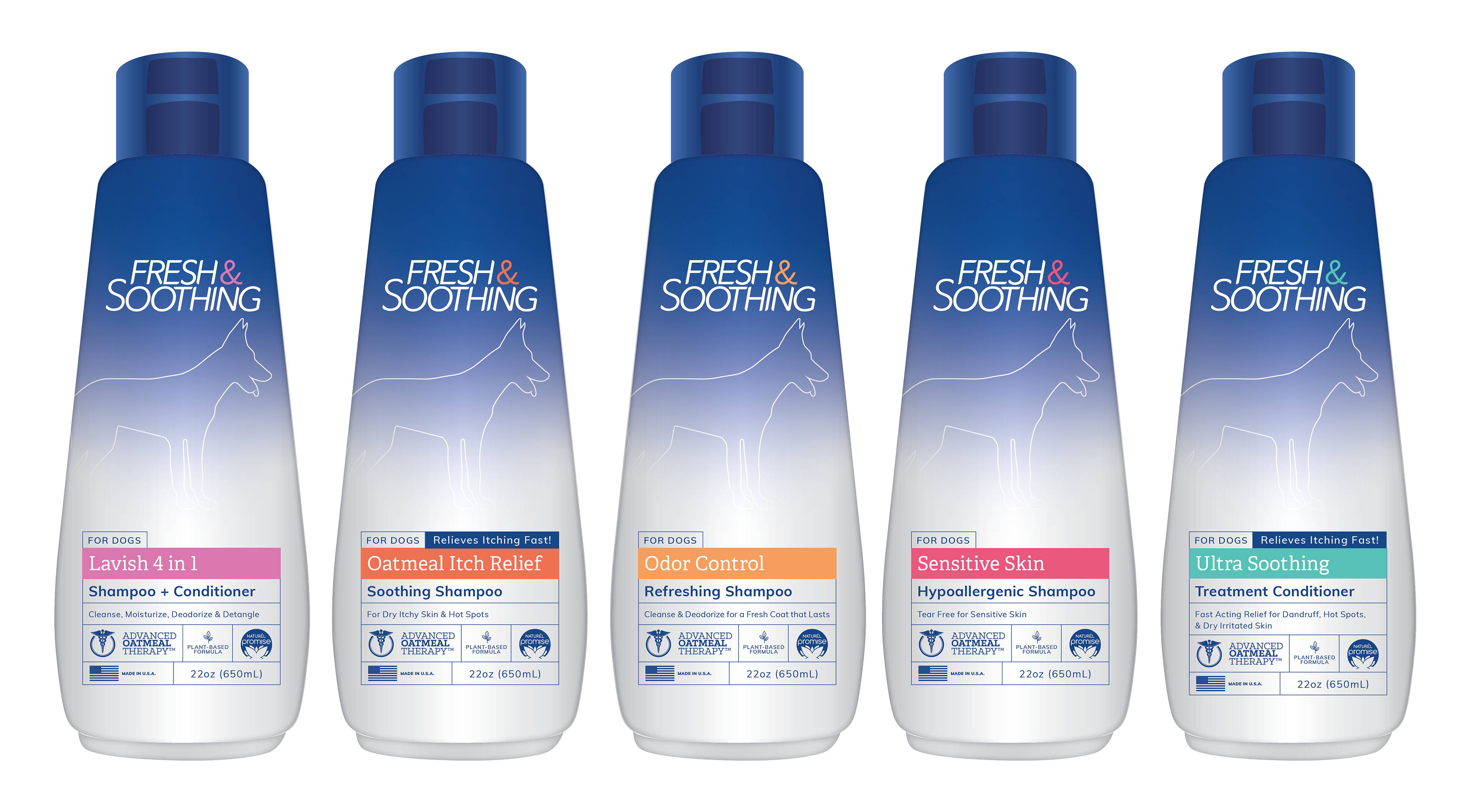
PROCESS: This project went through many rounds of revisions, as project specs evolved with the project. Initially, the idea was to have minimal art, without images of dogs, but it was determined that images were needed to best show the product was for dogs. You can see the many colors, shapes, and gradients I played with. And then later on in the process, you can see how I played around with the hierarchy and colors to achieve good balance in the design.